Your cart is currently empty!

seoagency@example.com

450 NW Couch Street, Oregon 97209

+(00) 123 4567 890
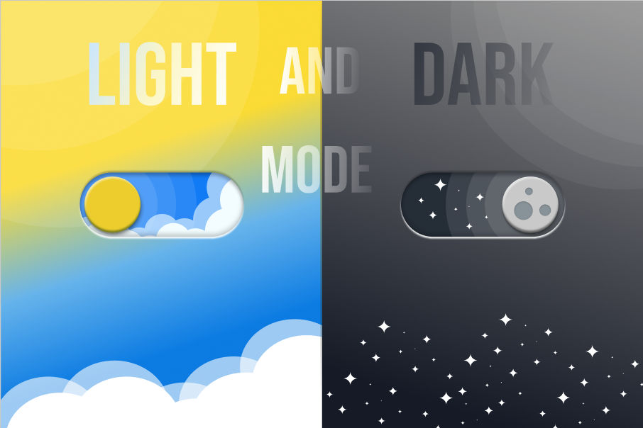
Trends in Web Design Dark mode and evolving color trends are at the forefront of web design in 2025, shaping both aesthetics and user experience.
Why Dark Mode Is Dominating
- Eye Comfort & Energy Efficiency: Dark mode reduces blue light exposure, minimizing eye strain and saving energy, especially on OLED screens.
- Modern Appeal: It gives websites a sleek, ultra-modern look, popular among tech, creative, and entertainment brands.
- User Control: Many sites now offer a toggle, letting users choose between dark and light modes for personalized comfort.
Best Practices for Dark Mode
- High Contrast: Use clear, high-contrast typography and color pairings to maintain readability against dark backgrounds.
- Accent Colors: Vibrant accents (like red or yellow) can highlight key elements and guide user attention.
- Consistent Branding: Dark mode can reinforce a brand’s identity, especially for companies aiming for a cutting-edge, stylish image.
2025 Color Trends
- Soothing Palettes: Designers are shifting from saturated hues to more nurturing, calming colors to reduce visual fatigue.
- Earthy & Warm Tones: Expect to see mocha, clay, terracotta, and muted rose, reflecting a desire for grounded, welcoming digital spaces.
- Red as an Accent: Red is making a strong comeback, used for bold highlights rather than as a main color.
- Multi-Tonal Schemes: Mixing several harmonious tones creates sophisticated, layered visuals that feel both modern and inviting.
- Pantone & Popular Colors: Mocha Mousse is Pantone’s color of the year, with other trending shades including digital lavender, navy blue, and sunny yellow.
Combining Dark Mode and Color Trends

- Contrast & Balance: Use lighter, soothing tones for text and interactive elements on dark backgrounds to ensure clarity and comfort.
- Vivid Blocks: Bold, block-based layouts with vibrant color contrasts are popular, especially for creative and SaaS brands.
- Personalization: Offering both dark and light modes with modern color palettes enhances accessibility and user satisfaction
The main benefits of using dark mode in web design are:
- Reduces eye strain and fatigue: Dark mode lowers the blue light emitted by screens, which helps minimize eye strain, especially in low-light environments or during prolonged screen use.
- Improves readability and focus: White or light text on a dark background often provides better contrast, enhancing readability for many users and helping reduce visual distractions, which can improve focus on content.
- Saves battery life on OLED/AMOLED screens: Dark mode turns off or dims pixels on OLED displays, significantly reducing power consumption and extending device battery life.
- Enhances visibility of design elements: Dark backgrounds make photos, icons, buttons, and other UI elements stand out more prominently, improving navigation and user interface clarity.
- Offers a modern, stylish aesthetic: Many users find dark mode visually appealing, associating it with sophistication, boldness, and sleekness, which can strengthen brand identity.
- Reduces blue light exposure: By emitting less blue light, dark mode may help improve sleep quality when using devices at night, complementing other blue light reduction tools.
- Increases inclusivity and user comfort: Offering dark mode caters to diverse user preferences and needs, including those with certain visual impairments, enhancing overall accessibility
Main Benefits of Using Colour Modes in Web Design
Using different colour modes-like dark mode, light mode, or custom palettes-offers several important benefits in web design:
- Enhances Usability and Accessibility: Thoughtful colour choices improve readability, navigation, and accessibility for all users, including those with visual impairments. Proper contrast and clear visual cues help users find information easily and interact with the site more comfortably.
- Shapes Brand Perception: Colour modes and palettes communicate a brand’s personality and values. For example, blue can convey trust, while green suggests growth. Consistent and strategic use of colour strengthens brand recognition and emotional connection with users.
- Guides User Behavior: Colours can direct attention to important elements like call-to-action buttons, links, or special offers, influencing user decisions and increasing conversion rates. Bright or contrasting colours highlight what matters most.
- Improves User Experience: Colour modes like dark mode reduce eye strain in low-light environments and can help users focus better by minimizing distractions. Light mode, on the other hand, is familiar and often preferred for reading-heavy content.
- Supports Modern Aesthetics and Trends: Offering multiple colour modes (e.g., dark and light) allows users to personalize their experience, aligning with modern UI trends and increasing engagement. Vibrant, bold colours or gradients can also make websites stand out and feel current.
- Boosts Brand Recognition: Studies show that effective use of colour can increase brand recognition by up to 80%, making your website more memorable and impactful.
- Saves Device Energy: Dark mode, especially on OLED screens, can reduce energy consumption and extend battery life for users
How Dark Mode Contributes to Improved SEO
Dark mode itself is not a direct ranking factor in Google’s search algorithm. However, it can indirectly improve your SEO through several key user experience and engagement metrics that search engines value:
- Reduces Bounce Rates: When users can browse comfortably-especially in low-light environments-they are less likely to leave your site quickly. Lower bounce rates signal to search engines that your content is relevant and engaging.
- Increases Dwell Time and Pages Viewed: Dark mode can make your site more visually comfortable, encouraging users to stay longer and explore more pages. Longer session durations and higher page views are positive behavioral signals for SEO.
- Improves Accessibility and Readability: Offering dark mode enhances accessibility for users with light sensitivity or those browsing at night, making your site usable for a broader audience. Improved accessibility can boost user satisfaction and retention.
- Enhances User Satisfaction: Satisfying user preferences (like dark mode) can lead to higher engagement, more repeat visits, and positive word-of-mouth-all factors that indirectly benefit SEO.
- Supports Mobile and Modern Browsing Trends: As mobile usage grows and more users expect dark mode, supporting it ensures your site remains competitive and appealing to a wider audience
Industries Where Light Mode Is More Beneficial
Yes, there are several industries and use cases where light mode is generally more beneficial than dark mode:
- Medical and Healthcare:
Medical device interfaces and healthcare applications often use light mode for better legibility and visual clarity, especially during critical tasks like surgeries or reading diagnostic information. Light backgrounds make text and graphics stand out, reducing the risk of errors in high-stakes environments. - Publishing, Education, and Heavy Reading:
Industries involving extensive reading-such as publishing, education, and legal-favor light mode because black text on a white background is easier to read for long periods and mimics the traditional look of books and print media. - Professional and Office Settings:
In brightly lit environments like offices, light mode offers superior readability and reduces eye strain compared to dark mode, which can cause halation (glow around text) and make reading more difficult. - Finance and Data Analysis:
Financial dashboards, spreadsheets, and data-heavy applications often use light mode to ensure high contrast and clear differentiation between data points, which is crucial for accuracy and productivity. - General Web and App Design:
Many mainstream websites and apps default to light mode as it provides familiarity, visual clarity, and is accessible to a broader audience, especially during daytime use
Categories: Uncategorized
Related Posts :-
Build a Graphic Design Portfolio That Gets You Hired in.
https://youtu.be/5sffVBeaOeY?si=mU-DOl2ZKghmVBI6 A graphic design portfolio is more than a gallery…
Dark Mode and Color Trends in Web Design (2025)
Trends in Web Design Dark mode and evolving color trends are…
Leave a Reply